JASON BROWN
CASE STUDY — ROADMAP PROJECT
The New AHx
Wellness Experience
ROLE
UX/UI Designer
DURATION
Q2 2025
TOOLS
Figma, FigJam, Figma Make
PROJECT TYPE
Roadmap Project
Introduction
THE REQUEST
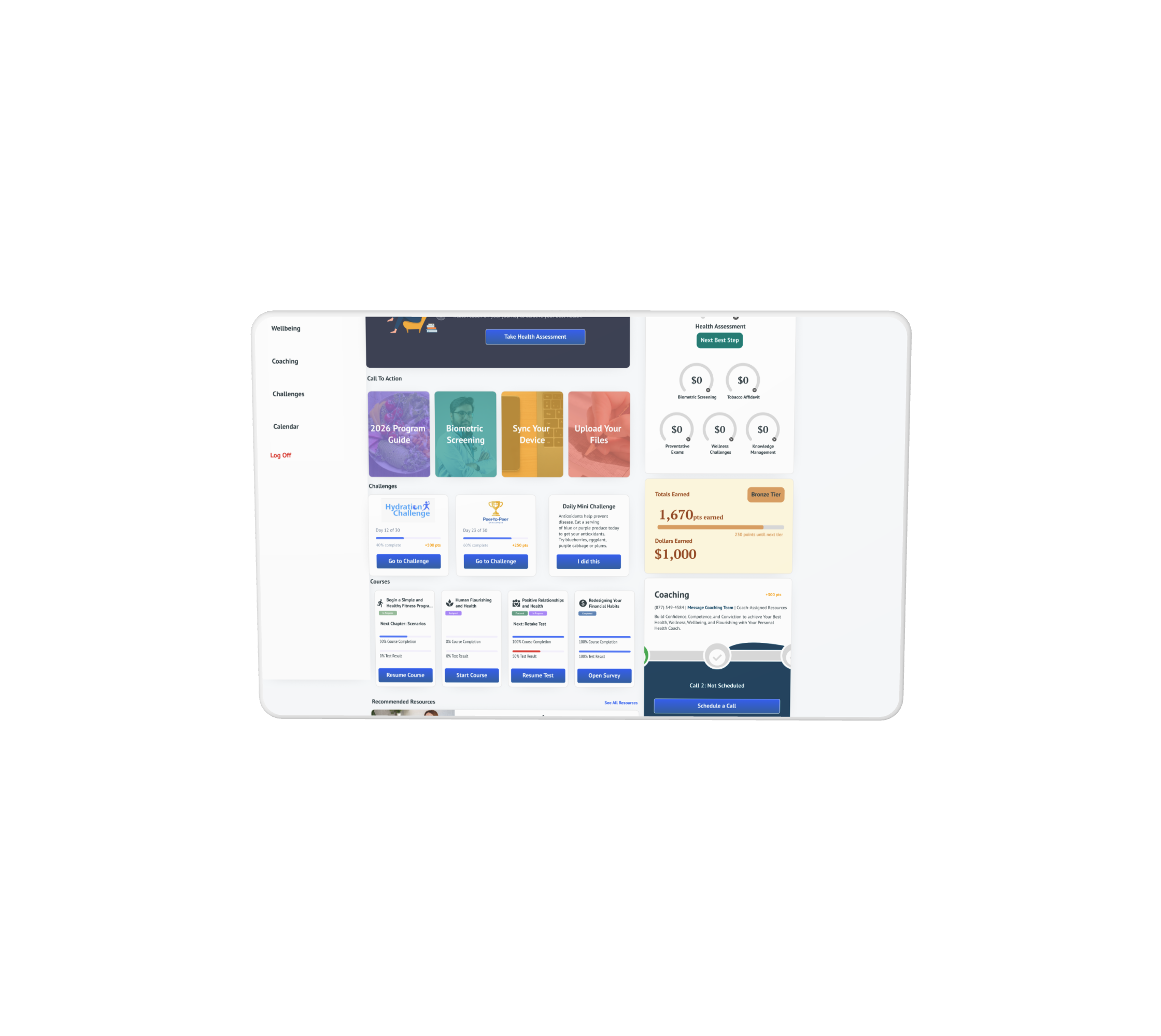
Our client sites were due for a massive upgrade — something more customizable to deploy within a builder and that looked great on mobile web.
THE USERS
Adults between 22–65 who want to improve their health and wellness.
THE SOLUTION
A redesign focused on simplifying navigation, establishing a consistent visual language, and streamlining core user flows to boost engagement.
The Process
Brainstorming
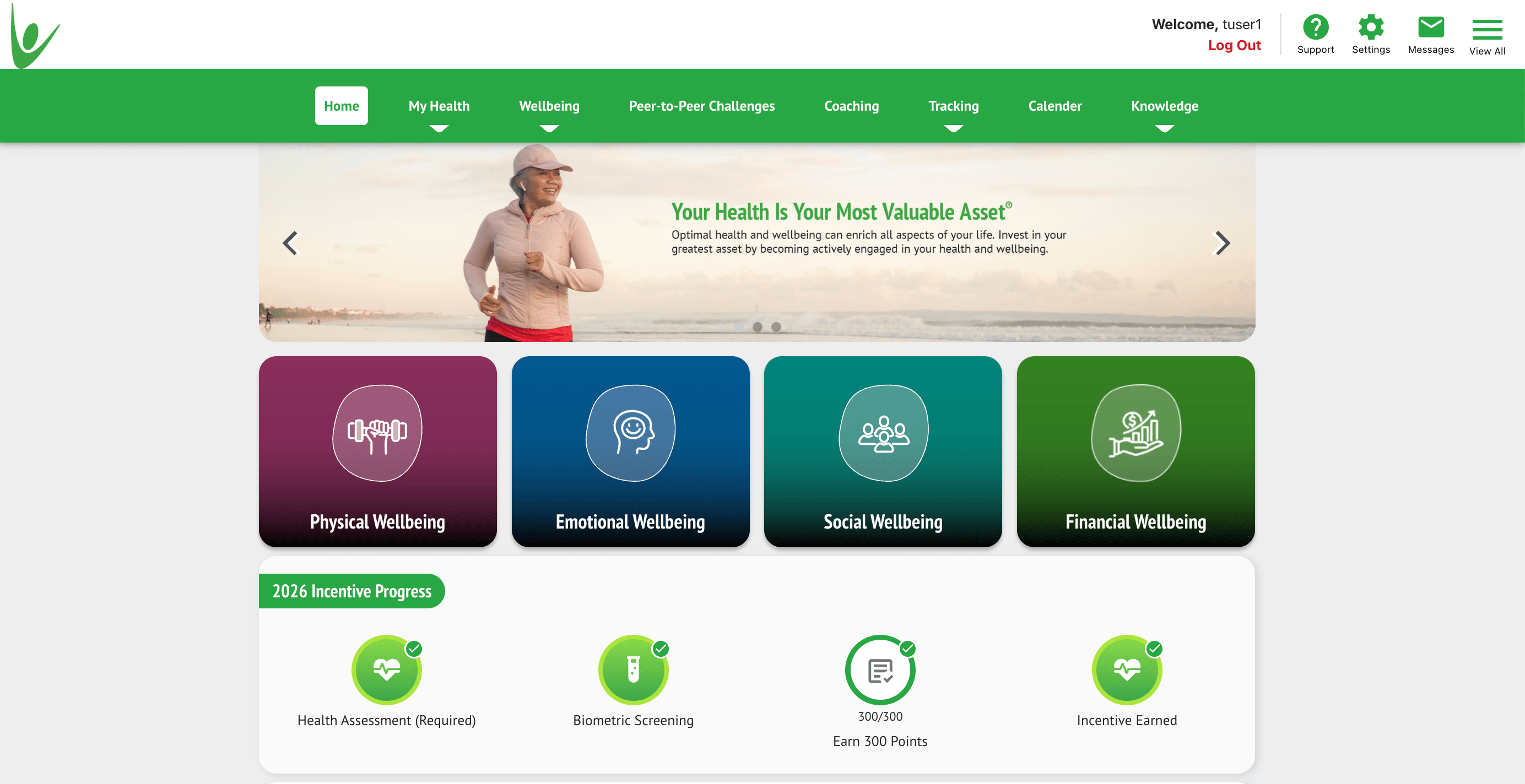
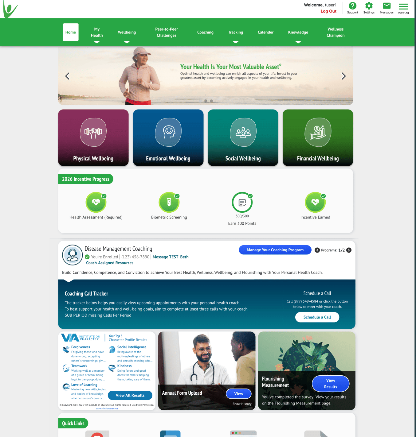
The visual design felt dated, with inconsistent typography, color usage, and iconography that no longer aligned with our brand. Navigation patterns were unintuitive, requiring too many taps to reach core features, and users often abandoned key flows.
GOALS FOR REDESIGN
✓
Simplify navigation
✓
Establish a consistent design system aligned with brand
✓
Improve accessibility through contrast and tap targets
✓
Streamline onboarding to improve retention
User Scenarios & Pain Points
The Time-Strapped Member
PAIN POINT
Logs in during a lunch break and can’t quickly tell where they left off in their wellness journey — too many taps to reach the features that actually matter to them.
GOAL
See progress and the next best action at a glance, without hunting through menus.
The Mobile-First User
PAIN POINT
The old experience wasn’t built for mobile web, so key incentive info and challenges were cramped and hard to tap on a phone.
GOAL
Complete challenges and check rewards comfortably from a phone, not just a desktop.
Ideate / Prototype
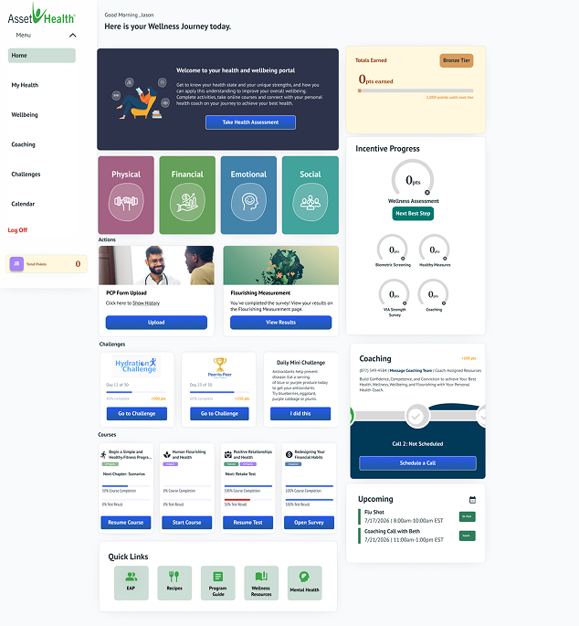
FROM THIS
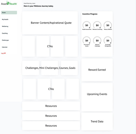
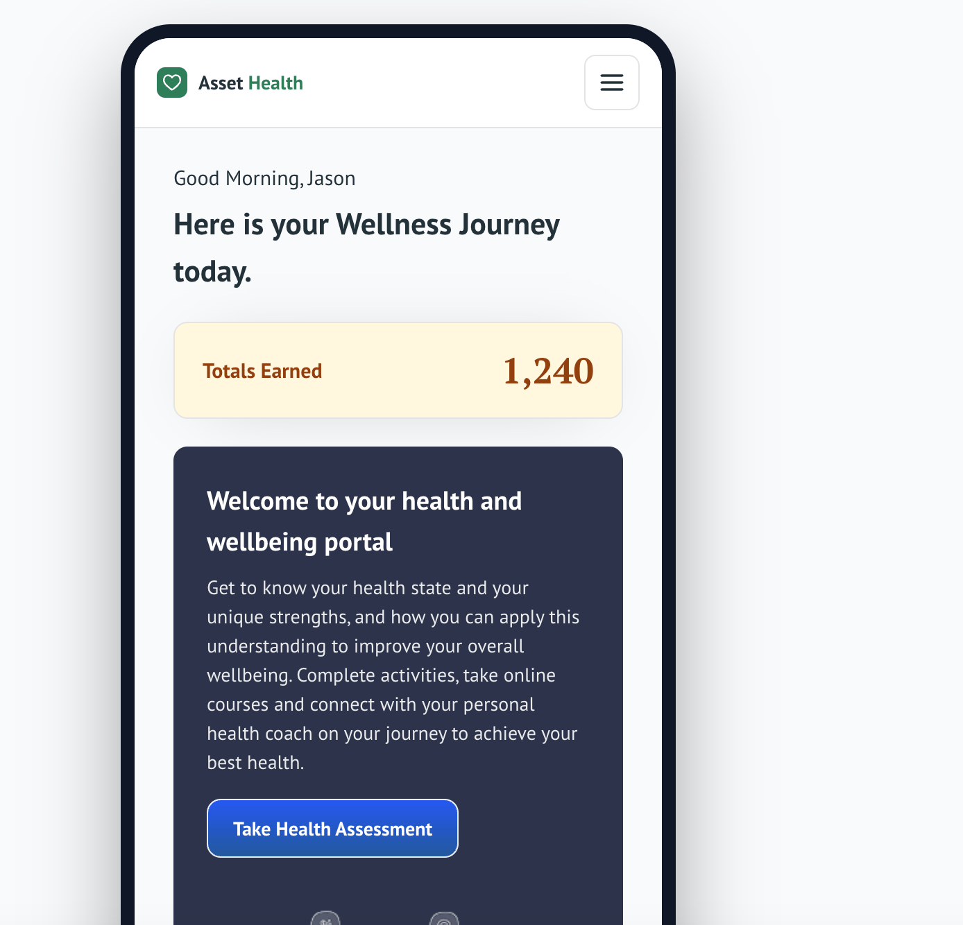
TO THIS
Key Design Decisions
1
Shrunk the banner down
Reduced hero size so incentive info surfaces without scrolling.
2
Pinned incentive progress near the top
Testing showed this was the #1 thing users logged in to check.
3
Moved resources below the fold
Rarely used day-to-day, so it no longer competes with primary actions.
What I Tested
Tested the new wireframe with 5 existing Asset Health members during a normal log in session. Two couldn’t find their incentive progress in the old design within 10 seconds; in the new layout, all five found it immediately. One tester asked for a smaller resources section, which led to the below-the-fold placement.
The Results
This redesign transformed the wellness platform from a collection of disconnected tools into a unified, user-centered experience. Through research, stakeholder collaboration, and iterative prototyping, we restructured the dashboard to prioritize clarity, personalization, and actionability.
Standardized components and design tokens improved collaboration between design and engineering, reducing implementation inconsistencies and accelerating future feature development.
ADOPTION & IMPACT — PLACEHOLDER, REPLACE WITH REAL NUMBERS


47%
Increase in weekly member engagement

92%
Member satisfaction with new dashboard

38%
Reduction in onboarding drop-off
Ready to see more?
View Next Project →
JASON BROWN
CASE STUDY — ROADMAP PROJECT
The New AHx
Wellness Experience
ROLE
UX/UI Designer
DURATION
Q2 2025
TOOLS
Figma, FigJam, Figma Make
PROJECT TYPE
Roadmap Project
Introduction
THE REQUEST
Our client sites were due for a massive upgrade — something more customizable to deploy within a builder and that looked great on mobile web.
THE USERS
Adults between 22–65 who want to improve their health and wellness.
THE SOLUTION
A redesign focused on simplifying navigation, establishing a consistent visual language, and streamlining core user flows to boost engagement.
The Process
Brainstorming
The visual design felt dated, with inconsistent typography, color usage, and iconography that no longer aligned with our brand. Navigation patterns were unintuitive, requiring too many taps to reach core features, and users often abandoned key flows.
GOALS FOR REDESIGN
✓
Simplify navigation
✓
Establish a consistent design system aligned with brand
✓
Improve accessibility through contrast and tap targets
✓
Streamline onboarding to improve retention
User Scenarios & Pain Points
The Time-Strapped Member
PAIN POINT
Logs in during a lunch break and can’t quickly tell where they left off in their wellness journey — too many taps to reach the features that actually matter to them.
GOAL
See progress and the next best action at a glance, without hunting through menus.
The Mobile-First User
PAIN POINT
The old experience wasn’t built for mobile web, so key incentive info and challenges were cramped and hard to tap on a phone.
GOAL
Complete challenges and check rewards comfortably from a phone, not just a desktop.
Ideate / Prototype
FROM THIS
TO THIS
Key Design Decisions
1
Shrunk the banner down
Reduced hero size so incentive info surfaces without scrolling.
2
Pinned incentive progress near the top
Testing showed this was the #1 thing users logged in to check.
3
Moved resources below the fold
Rarely used day-to-day, so it no longer competes with primary actions.
What I Tested
Tested the new wireframe with 5 existing Asset Health members during a normal log in session. Two couldn’t find their incentive progress in the old design within 10 seconds; in the new layout, all five found it immediately. One tester asked for a smaller resources section, which led to the below-the-fold placement.
The Results
This redesign transformed the wellness platform from a collection of disconnected tools into a unified, user-centered experience. Through research, stakeholder collaboration, and iterative prototyping, we restructured the dashboard to prioritize clarity, personalization, and actionability.
Standardized components and design tokens improved collaboration between design and engineering, reducing implementation inconsistencies and accelerating future feature development.
ADOPTION & IMPACT — PLACEHOLDER, REPLACE WITH REAL NUMBERS
47%
Increase in weekly member engagement
92%
Member satisfaction with new dashboard
38%
Reduction in onboarding drop-off
Ready to see more?
View Next Project →
JASON BROWN
Home
Next Project →
CASE STUDY — ROADMAP PROJECT
The New AHx
Wellness Experience
ROLE
UX/UI Designer
DURATION
Q2 2025
TOOLS
Figma, FigJam, Figma Make
PROJECT TYPE
Roadmap Project
Introduction
THE REQUEST
Our client sites were due for a massive upgrade — something more customizable to deploy within a builder and that looked great on mobile web.
THE USERS
Adults between 22–65 who want to improve their health and wellness.
THE SOLUTION
A redesign focused on simplifying navigation, establishing a consistent visual language, and streamlining core user flows to boost engagement.
The Process
Brainstorming
The visual design felt dated, with inconsistent typography, color usage, and iconography that no longer aligned with our brand. Navigation patterns were unintuitive, requiring too many taps to reach core features, and users often abandoned key flows.
GOALS FOR REDESIGN
✓
Simplify navigation
✓
Establish a consistent design system aligned with brand
✓
Improve accessibility through contrast and tap targets
✓
Streamline onboarding to improve retention
User Scenarios & Pain Points
The Time-Strapped Member
PAIN POINT
Logs in during a lunch break and can’t quickly tell where they left off in their wellness journey — too many taps to reach the features that actually matter to them.
GOAL
See progress and the next best action at a glance, without hunting through menus.
The Mobile-First User
PAIN POINT
The old experience wasn’t built for mobile web, so key incentive info and challenges were cramped and hard to tap on a phone.
GOAL
Complete challenges and check rewards comfortably from a phone, not just a desktop.
Ideate / Prototype
FROM THIS
TO THIS
Key Design Decisions
1
Shrunk the banner down
Reduced hero size so incentive info surfaces without scrolling.
2
Pinned incentive progress near the top
Testing showed this was the #1 thing users logged in to check.
3
Moved resources below the fold
Rarely used day-to-day, so it no longer competes with primary actions.
What I Tested
Tested the new wireframe with 5 existing Asset Health members during a normal log in session. Two couldn’t find their incentive progress in the old design within 10 seconds; in the new layout, all five found it immediately. One tester asked for a smaller resources section, which led to the below-the-fold placement.
The Results
This redesign transformed the wellness platform from a collection of disconnected tools into a unified, user-centered experience. Through research, stakeholder collaboration, and iterative prototyping, we restructured the dashboard to prioritize clarity, personalization, and actionability.
Standardized components and design tokens improved collaboration between design and engineering, reducing implementation inconsistencies and accelerating future feature development.
ADOPTION & IMPACT — PLACEHOLDER, REPLACE WITH REAL NUMBERS
47%
Increase in weekly member engagement
92%
Member satisfaction with new dashboard
38%
Reduction in onboarding drop-off
Ready to see more?
View Next Project →