JASON BROWN
CASE STUDY — INTERNAL TOOL
Redesign of the
Core Coaching Tool
ROLE
UX/UI Designer, Stakeholder
DURATION
Q3 2024
TOOLS
Figma, FigJam, Figma Make, Claude Design
PROJECT TYPE
Internal Tool
Introduction
THE REQUEST
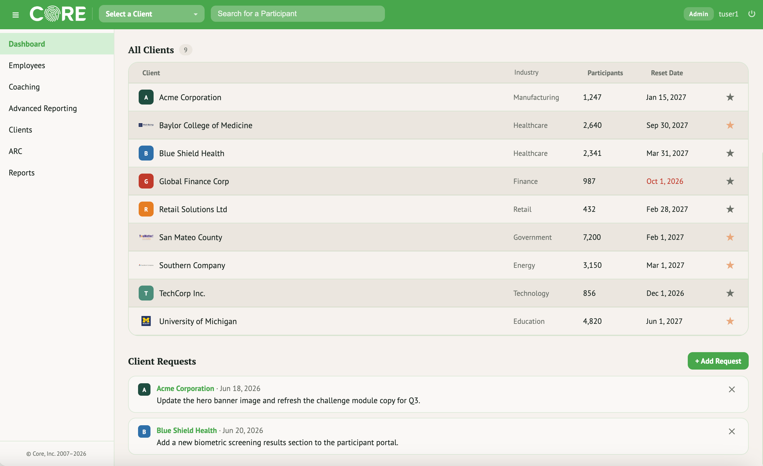
Our health coaches requested a system that was more streamlined. It started as just one feature but turned into a larger redesign.
THE USERS
Asset Health employees using the system internally, QA analysts running tests, and health coaches who run client calls through it.
THE SOLUTION
Redesigning the coaching feature revealed a need for a cleaner visual hierarchy and process across the entire tool, not just for coaches.
The Process
Brainstorming
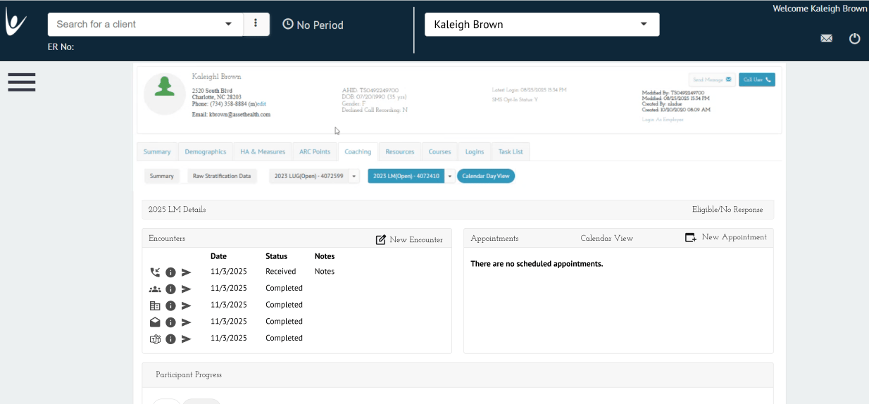
The existing version was built long ago without UX principles — the design was bland and functionality was limited in scope. We saw room to make it more flexible for coaches and simplify key processes.
GOALS FOR REDESIGN
✓
Quick glance dashboard
✓
Establish a consistent design system aligned with brand
✓
Reduce the flow for a coach
✓
Streamline quick access to key features
User Scenarios & Pain Points
The Health Coach on a Call
PAIN POINT
Needs to jump across multiple tabs mid-call just to see a client’s metrics and appointment history, slowing the conversation down.
GOAL
See a client’s key metrics and schedule in one glance while on a live call.
The QA Analyst
PAIN POINT
Testing flows across an inconsistent, dated interface makes it hard to verify features quickly and catch inconsistencies.
GOAL
Navigate a consistent, predictable interface that speeds up testing and reduces errors.
Ideate / Prototype
FROM THIS
TO THIS
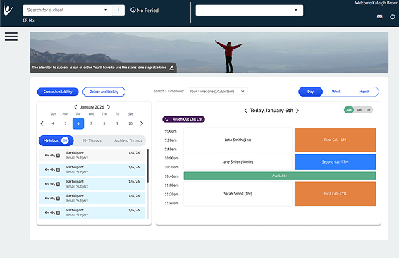
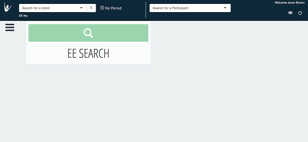
The client screen changes from a non-unified font hierarchy to a visually consistent identity. The tabs become more consistent and there are dashboard features that give easily identifiable metrics for the coach to observe.
However, it still did not feel right. It needed a little more unity and visual clarity.
Key Design Decisions
1
Added a quick-glance dashboard
Coaches said they needed one screen to prep for a call, not five tabs.
2
Elevated client metrics as colored tiles
Makes an at-risk client visually obvious mid-call.
3
Consolidated the appointment queue
Removes the need to cross-reference two separate screens.
What I Tested
Walked two health coaches through the prototype before a real client call. Both said the old system took roughly a minute to gather the same info the new dashboard surfaces instantly. One flagged that the metric tiles needed color coding to scan faster under time pressure. I added in the next design pass.
The Results
This redesign of the Core internal coaching platform reduces administrative overhead and keeps coaches focused on meaningful client interactions, consolidating scheduling, client insights, and communication into a single dashboard.
The result is a more efficient workspace that gives coaches more time to focus on what matters most: building stronger relationships and delivering personalized guidance.
ADOPTION & IMPACT — PLACEHOLDER, REPLACE WITH REAL NUMBERS


65%
Faster prep time before client calls

82%
Coach satisfaction with new dashboard

40%
Fewer support tickets logged
Ready to see more?
View Next Project →
JASON BROWN
CASE STUDY — INTERNAL TOOL
Redesign of the
Core Coaching Tool
ROLE
UX/UI Designer, Stakeholder
DURATION
Q3 2024
TOOLS
Figma, FigJam, Figma Make, Claude Design
PROJECT TYPE
Internal Tool
Introduction
THE REQUEST
Our health coaches requested a system that was more streamlined. It started as just one feature but turned into a larger redesign.
THE USERS
Asset Health employees using the system internally, QA analysts running tests, and health coaches who run client calls through it.
THE SOLUTION
Redesigning the coaching feature revealed a need for a cleaner visual hierarchy and process across the entire tool, not just for coaches.
The Process
Brainstorming
The existing version was built long ago without UX principles — the design was bland and functionality was limited in scope. We saw room to make it more flexible for coaches and simplify key processes.
GOALS FOR REDESIGN
✓
Quick glance dashboard
✓
Establish a consistent design system aligned with brand
✓
Reduce the flow for a coach
✓
Streamline quick access to key features
User Scenarios & Pain Points
The Health Coach on a Call
PAIN POINT
Needs to jump across multiple tabs mid-call just to see a client’s metrics and appointment history, slowing the conversation down.
GOAL
See a client’s key metrics and schedule in one glance while on a live call.
The QA Analyst
PAIN POINT
Testing flows across an inconsistent, dated interface makes it hard to verify features quickly and catch inconsistencies.
GOAL
Navigate a consistent, predictable interface that speeds up testing and reduces errors.
Ideate / Prototype
FROM THIS
TO THIS
The client screen changes from a non-unified font hierarchy to a visually consistent identity. The tabs become more consistent and there are dashboard features that give easily identifiable metrics for the coach to observe.
However, it still did not feel right. It needed a little more unity and visual clarity.
Key Design Decisions
1
Added a quick-glance dashboard
Coaches said they needed one screen to prep for a call, not five tabs.
2
Elevated client metrics as colored tiles
Makes an at-risk client visually obvious mid-call.
3
Consolidated the appointment queue
Removes the need to cross-reference two separate screens.
What I Tested
Walked two health coaches through the prototype before a real client call. Both said the old system took roughly a minute to gather the same info the new dashboard surfaces instantly. One flagged that the metric tiles needed color coding to scan faster under time pressure. I added in the next design pass.
The Results
This redesign of the Core internal coaching platform reduces administrative overhead and keeps coaches focused on meaningful client interactions, consolidating scheduling, client insights, and communication into a single dashboard.
The result is a more efficient workspace that gives coaches more time to focus on what matters most: building stronger relationships and delivering personalized guidance.
ADOPTION & IMPACT — PLACEHOLDER, REPLACE WITH REAL NUMBERS
65%
Faster prep time before client calls
82%
Coach satisfaction with new dashboard
40%
Fewer support tickets logged
Ready to see more?
View Next Project →
JASON BROWN
Home
Next Project →
CASE STUDY — INTERNAL TOOL
Redesign of the
Core Coaching Tool
ROLE
UX/UI Designer, Stakeholder
DURATION
Q3 2024
TOOLS
Figma, FigJam, Figma Make, Claude Design
PROJECT TYPE
Internal Tool
Introduction
THE REQUEST
Our health coaches requested a system that was more streamlined. It started as just one feature but turned into a larger redesign.
THE USERS
Asset Health employees using the system internally, QA analysts running tests, and health coaches who run client calls through it.
THE SOLUTION
Redesigning the coaching feature revealed a need for a cleaner visual hierarchy and process across the entire tool, not just for coaches.
The Process
Brainstorming
The existing version was built long ago without UX principles — the design was bland and functionality was limited in scope. We saw room to make it more flexible for coaches and simplify key processes.
GOALS FOR REDESIGN
✓
Quick glance dashboard
✓
Establish a consistent design system aligned with brand
✓
Reduce the flow for a coach
✓
Streamline quick access to key features
User Scenarios & Pain Points
The Health Coach on a Call
PAIN POINT
Needs to jump across multiple tabs mid-call just to see a client’s metrics and appointment history, slowing the conversation down.
GOAL
See a client’s key metrics and schedule in one glance while on a live call.
The QA Analyst
PAIN POINT
Testing flows across an inconsistent, dated interface makes it hard to verify features quickly and catch inconsistencies.
GOAL
Navigate a consistent, predictable interface that speeds up testing and reduces errors.
Ideate / Prototype
FROM THIS
TO THIS
The client screen changes from a non-unified font hierarchy to a visually consistent identity. The tabs become more consistent and there are dashboard features that give easily identifiable metrics for the coach to observe.
However, it still did not feel right. It needed a little more unity and visual clarity.
Key Design Decisions
1
Added a quick-glance dashboard
Coaches said they needed one screen to prep for a call, not five tabs.
2
Elevated client metrics as colored tiles
Makes an at-risk client visually obvious mid-call.
3
Consolidated the appointment queue
Removes the need to cross-reference two separate screens.
What I Tested
Walked two health coaches through the prototype before a real client call. Both said the old system took roughly a minute to gather the same info the new dashboard surfaces instantly. One flagged that the metric tiles needed color coding to scan faster under time pressure. I added in the next design pass.
The Results
This redesign of the Core internal coaching platform reduces administrative overhead and keeps coaches focused on meaningful client interactions, consolidating scheduling, client insights, and communication into a single dashboard.
The result is a more efficient workspace that gives coaches more time to focus on what matters most: building stronger relationships and delivering personalized guidance.
ADOPTION & IMPACT — PLACEHOLDER, REPLACE WITH REAL NUMBERS
65%
Faster prep time before client calls
82%
Coach satisfaction with new dashboard
40%
Fewer support tickets logged
Ready to see more?
View Next Project →